When Sarah Chen’s 72-inch sofa sat beneath a single 24-inch print, the proportions felt off, and guests rarely noticed her carefully chosen piece. You face this same sizing dilemma, or perhaps your gallery wall clusters too tightly, or your lighting casts harsh shadows across framed surfaces.
These seven methods solve specific, measurable problems with exact spacing, heights, and hardware selections. You will learn to calculate two-thirds ratios, maintain 57-inch centerlines, and position adjustable fixtures at 30-degree angles. Each solution includes clear steps, common errors to avoid, and the precise outcomes you can expect.
Choose Your Living Room Wall Decor Type: Art, Texture, or Built-Ins
Start by determining whether your wall should display framed artwork, architectural texture, or functional storage.
1. Art-Focused Approaches
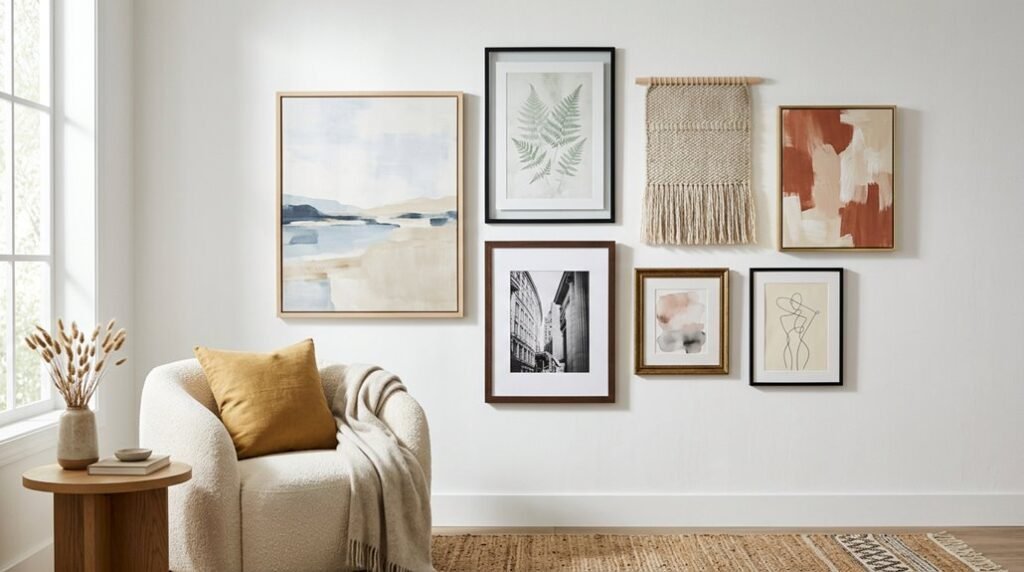
You’ll create cohesion in your gallery wall by repeating color, frame finish, or subject across pieces. Mix genres and scales freely; your through-line unifies them.
Center art 57–60 inches from the floor, maintaining 2–3 inch gaps between frames.
2. Textural Solutions
You’ll reduce reliance on framed art by applying texture through plaster, limewash, shiplap, or wainscot. These architectural elements provide permanent wall decor that anchors your space without maintenance.
3. Built-In Systems
You’ll gain flexibility with built-ins and shelves, enabling layered displays that rotate easily. This wall decor approach prevents wall damage while accommodating evolving collections.
Cohesive framing and spacing unify art, texture, and built-ins when combined.
Start With a Focal Piece Above the Sofa
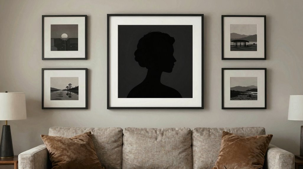
Once you’ve selected your wall decor type, you’ll anchor the arrangement by establishing a dominant piece above the sofa. Size your focal piece between two-thirds and three-quarters of your sofa’s width for balanced visual impact. Center this wall art at eye level, positioning the midpoint 57–60 inches from the floor to match seated viewing height.
Select a single large abstract or bold graphic to establish your room’s center of gravity. If you prefer a gallery arrangement, your focal piece should remain visually dominant while supporting elements complement without competing.
Match your artwork’s color temperature to your lighting environment. Use warm tones (2700K–3000K) to enhance coziness in the sofa area. This creates a welcoming space where family and guests naturally gather, connecting through shared visual experience.
Build a Gallery Wall With Proper Spacing and Rhythm
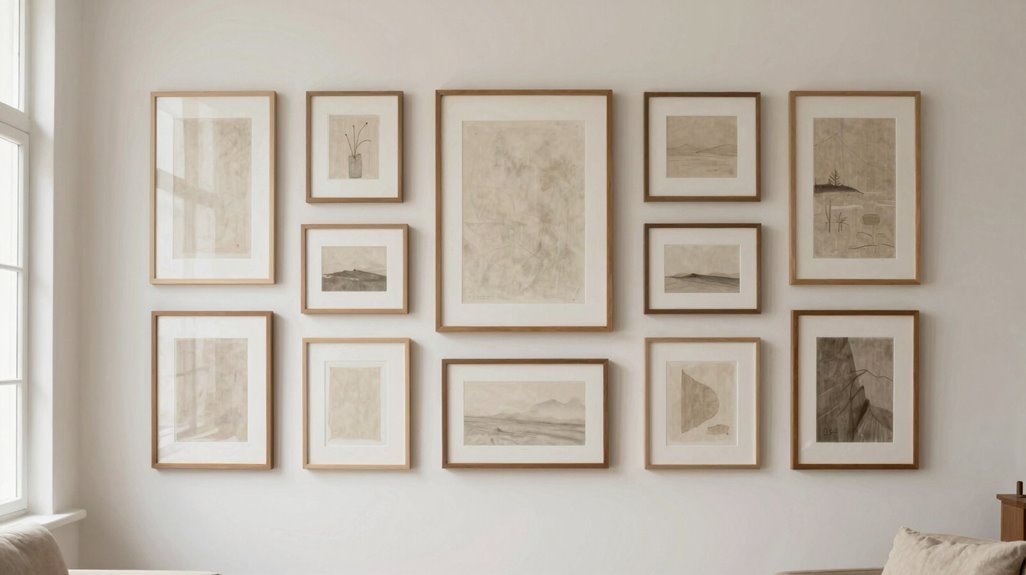
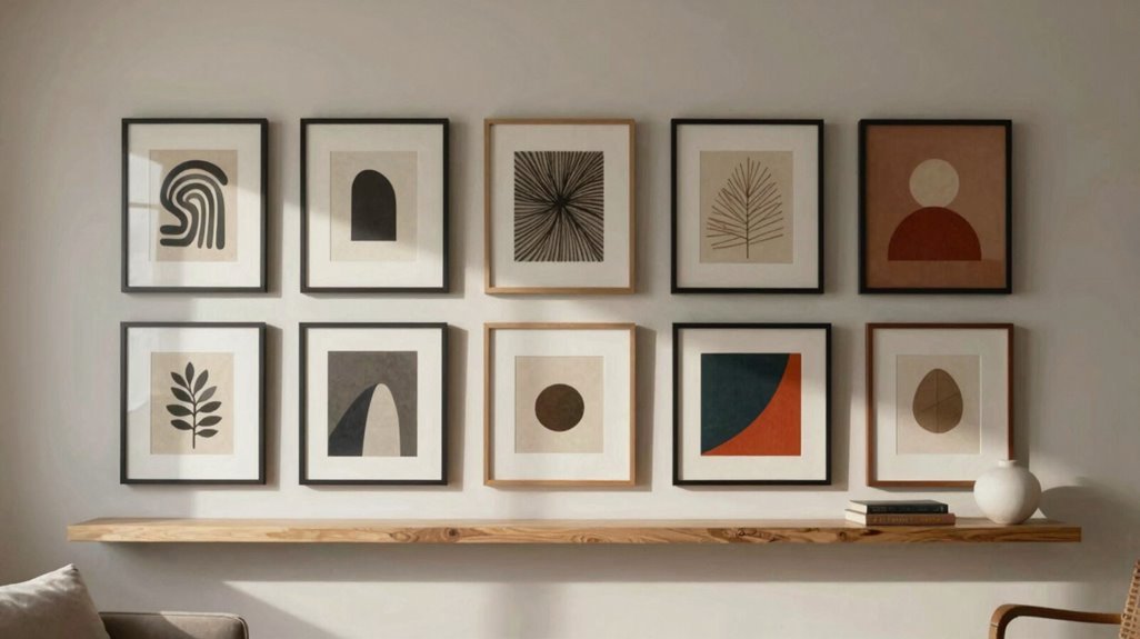
You’ll establish visual rhythm by maintaining consistent 2–3 inch gaps between frames, whether you choose a rigid grid for modern order or a salon-style cluster for organic flow.
Balance your composition around a dominant 40-inch-plus anchor piece, distributing smaller works asymmetrically to create tension without chaos. Treat spacing as a measurable system, not an aesthetic guess, and you’ll avoid the cluttered look that undermines most gallery walls.
Spacing Between Pieces
How do you turn a cluster of frames into a unified composition? You’ll master spacing, the critical element that separates amateur displays from professional gallery wall installations.
1. Establish Standard Gaps
Maintain 2–3 inches between frames. This spacing creates breathable rhythm without fragmenting your wall art arrangement.
2. Plan Your Frame Layout First
Arrange pieces on the floor before mounting. Visualize spacing relationships between sizes and shapes to prevent costly errors.
3. Choose Your Structural Approach
| Layout Type | Spacing Characteristic | Visual Effect |
|---|---|---|
| Symmetrical | Equal gaps, uniform frames | Classic, orderly |
| Asymmetrical | Varied gaps, mixed sizes | Dynamic, energetic |
4. Position for Viewing
Center artwork 57–60 inches from floor level, adjusting slightly for seating arrangements.
5. Anchor Above Furniture
Make sure artwork spans two-thirds to three-quarters of furniture width, letting this proportion guide your spacing decisions for cohesive integration.
Rhythm and Balance
Where does a gallery wall acquire its sense of motion and equilibrium? You build it through deliberate rhythm and balance.
1. Establish your through-line: Repeat a color, frame finish, or subject across pieces, while mixing genres and scales for curated dynamism.
2. Choose your structure:
- Grid: Modern, orderly feel with uniform spacing
- Salon-style: European, collected-over-time cluster
3. Maintain breathing room: Space frames two to three inches apart for visual calm.
4. Anchor with scale: Position a 40+ inch abstract as your center of gravity.
5. Plan before hanging: Layout on floor first, then install at 57–60 inches eye level for optimal viewing from seating areas.
Your wall achieves belonging when every element connects, yet breathes.
Hang All Living Room Wall Decor at True Eye Level
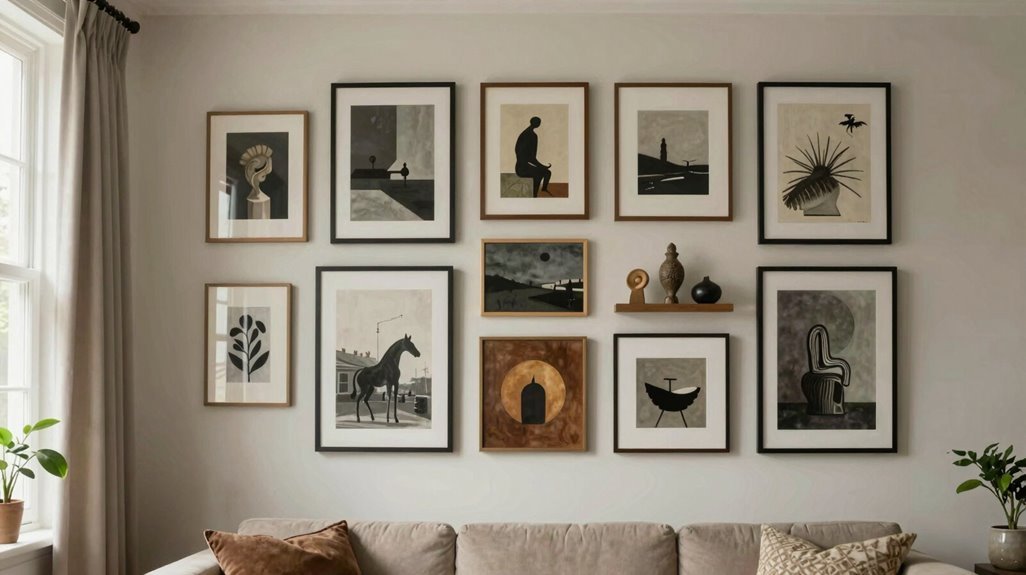
The 57–60 inch rule establishes a reliable anchor for every piece you hang, creating a consistent sightline that prevents the scattered, floating effect of arbitrarily placed art. You’ll position the center of each artwork at this eye level height, adjusting slightly for seated viewing while maintaining the core guideline.
Above sofas, select art measuring two-thirds to three-quarters of your sofa’s width, hanging it 6–12 inches above the backrest.
| Wall Placement Scenario | Target Measurement | Spacing Guideline |
|---|---|---|
| Standard eye level | 57–60 inches from floor | Center of frame |
| Above sofa | 6–12 inches above backrest | Width: ⅔–¾ of sofa |
| Gallery wall | Maintain 57–60 inch center line | 2–3 inches between frames |
Map your gallery wall on the floor first, confirming cohesive eye level alignment before committing to hardware.
Mix Wall Decor Formats: Paintings, Photos, and Dimensional Pieces
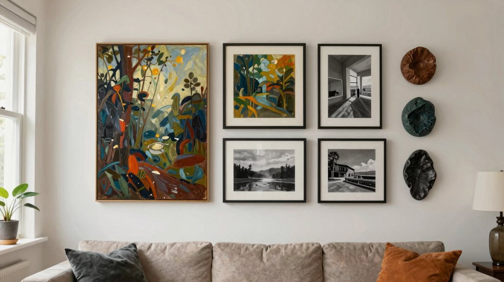
You’ll create layered visual depth by combining paintings, photographs, and dimensional wall sculptures in unified displays, making sure each medium contributes distinct texture and spatial variation. Maintain cohesion across diverse formats through consistent framing finishes or repeated accent colors, while staggering sizes between 8×10 inches and 36×48 inches to establish rhythmic proportion.
Position larger abstract paintings as primary anchors, then cluster smaller framed photos and 3D pieces within 2–3 inch gaps to achieve balanced, scalable arrangements.
Diverse Medium Combinations
Because your walls contain multiple formats, you’ll need a systematic approach to unify paintings, photographs, and dimensional pieces into one coherent display.
- Establish your gallery layout around a focal painting, positioning this anchor at center or above your sofa.
- Build mixed media clusters using 2–3 inch spacing between frames, maintaining related styles across all pieces.
- Layer smaller photographs and dimensional elements, such as metal sculptures and ceramic pieces, around your anchor. Vary sizes and orientations intentionally.
- Lock in a cohesive color palette: tie warm neutrals through every medium, adding bold accents that appear in paintings, photo tones, and textured surfaces alike.
- Install adjustable sconces or track lighting to illuminate paintings, photographs, and 3D elements evenly, eliminating glare while protecting diverse surfaces.
Layered Visual Depth
When you’re working with flat paintings, framed photographs, and protruding dimensional pieces, you’re building a relief sculpture across your wall surface, and this requires precise sequencing to avoid visual chaos. You’ll achieve layered depth by combining formats that create varying surface textures and light reflections across your wall.
- Plan your gallery-style layout on the floor first, maintaining 2–3 inch gaps between frames to establish an intentional, cohesive through-line across different formats.
- Incorporate three-dimensional wall art, such as sculptural elements or ceramic accents, which cast shadows and add physical depth beyond flat artworks.
- Layer leaning pieces on mantels or shelves in front of higher-mounted art, creating multi-tiered displays without permanent nail placements.
- Maintain consistent balancing elements; frame color or unifying palette, to preserve harmony while enhancing perceived depth through texture variation.
Unify Your Living Room Wall Decor With a Cohesive Color Palette
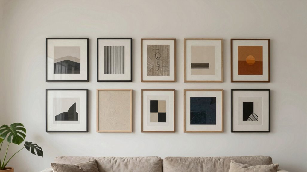
How do you turn a scattered collection of artwork into a unified visual statement? You establish a color palette that repeats dominant hues across frames, mats, and surrounding decor, creating a look that feels deliberate rather than accidental.
For effective wall art coordination, follow this three-part strategy:
- Select analogous or complementary schemes to balance warm and cool tones without over-matching
- Position pieces so color relationships echo your furniture and textiles, reinforcing a consistent mood
- Preview combinations virtually or with physical mock-ups before finalizing placement
You’ll want to use a neutral backdrop, beige, gray, or off-white, to let bold accent colors pop without clashing. This controlled approach keeps your gallery wall visually harmonious across both expansive walls and tight clusters, giving your space the polished, collected feel you’re seeking.
Light Your Wall Decor Without Creating Glare
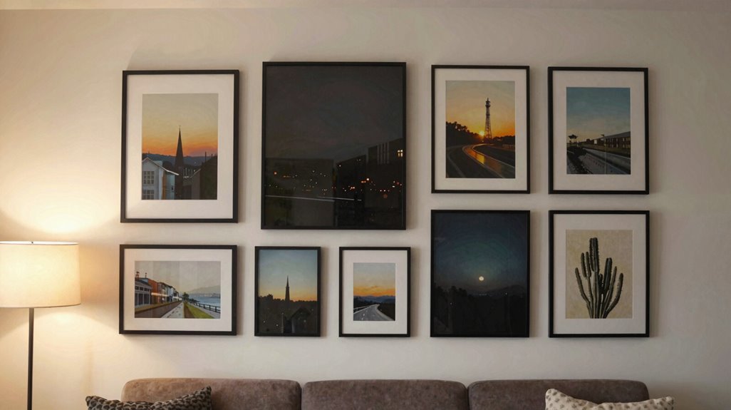
You’ll want dimmable lighting to control intensity as daylight changes, preventing harsh contrasts that strain your eyes and disrupting your space’s cohesion. Choose warm color temperature settings between 2700K and 3000K, since cooler temperatures create harsher reflections that feel sterile and unwelcoming.
For gallery walls, employ track or directional fixtures to maintain consistent brightness across multiple pieces. Adjust positions or add diffusers to eliminate reflections from windows or glossy frames, so your collection looks purposefully arranged and inviting.